Styling Squarespace Summary Carousel Arrows Like List Section Carousels
Squarespace 7.1’s list section types, both Carousels and Banner Slideshows, have gloriously prominent back and forward arrows so it’s clear that this is scrolling content. The Carousel Summary Block, on the other hand, has tiny, awkwardly placed arrows in the upper righthand corner of the block that are easy to miss. My clients frequently ask me, “Can’t you make these summary block arrows look like those arrows list section carousel arrows?”

Carousel Section arrows everybody likes

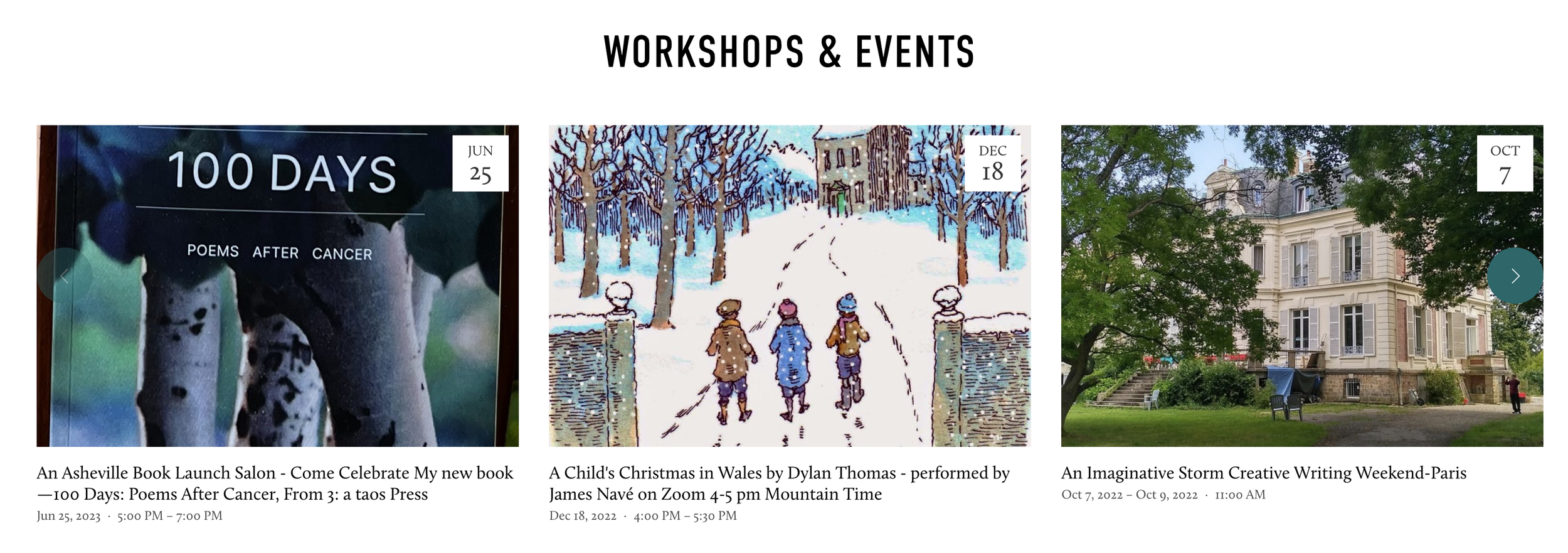
Summary Block Carousel arrows everybody hates
(can you even find them?)
So I did some poking around and found this post on styling the summary block arrows, then made my own style customizations to make the arrows more similar to the list section carousel. Here’s the result on desktop:
To recreate this desktop style, navigate to your Custom CSS panel, then paste the following code:
//Summary carousel arrows
@media screen and (min-width:783px) {
.sqs-block-summary-v2 .summary-block-setting-design-carousel .summary-carousel-pager {
  float: none;
  width: 100%;
  position: absolute;
  bottom: 50%;
  left: 50%;
  -webkit-transform: translate(-50%,-35%);
  -ms-transform: translate(-50%,-35%)
  transform: translate(-50%,-35%);
  -webkit-box-pack: justify;
  -ms-flex-pack: justify;
  justify-content: space-between;
  z-index: 9;
  }
.sqs-gallery-design-carousel .sqs-gallery-controls .next::before { background-color: #01686b; color: #fff; padding: 20px; border-radius:50%; }.sqs-gallery-design-carousel .sqs-gallery-controls .previous::before { background-color: #01686b; color: #fff; padding: 20px; border-radius:50%; } }
Change the hex codes of the background-color to whatever color you want the circles around the arrows to be.
I also made a simple customization to the mobile style so the arrows appear on either side of the screen, rather than awkwardly in the upper right corner:
@media screen and (max-width:782px) {
.sqs-block-summary-v2 .summary-block-setting-design-carousel .summary-carousel-pager {
  float: none;
  width: 100%;
  position: absolute;
  top: 0%;
  left: 50%;
  -webkit-transform: translate(-50%,-50%);   -ms-transform: translate(-50%,-50%);
   transform: translate(-50%,-50%);
  -webkit-box-pack: justify;
  -ms-flex-pack: justify;
  justify-content: space-between;
  z-index: 9;
  }
}

Hope this is helpful to make your summary block carousels as awesome as you hope them to be!