Sticky (Fixed) Header for Brine Templates
If you are building a Squarespace website using a template in the Brine family, this hack will help you to create a fixed/sticky navigation bar that stays at the top of the page as you scroll. I’ve perfected these options over many different websites, and I’m quite proud of them.
The first thing to realize about the Brine template is that it offers two header navigation areas: top and bottom. The top header is a solid colored bar at the very top of the page, above any page banners. The bottom header overlaps page banners. The two may be used individually or as a combination.

top header only

bottom header only

top and bottom combo header

This is a combo header; it uses both top and bottom positions.
We can create a fixed header for a top header, a bottom header, or a combo header. To determine which header(s) your site is using and which one(s) to make sticky, go to Design—>Site Styles and check your header layout.
Based on which header type you’re using, choose from the three options below:
Fixed Top Header

Step 1: In your admin panel, go to Design—>Custom CSS. Paste the following code in the Custom CSS area:
.Header.Header--top {
  position: fixed;
  top: 0px;
  z-index:1000;
  width:100%;
  box-shadow: 0px 2px 3px rgba(0,0,0,0.1)
}
The last item in this list creates a light shadow behind the header, which gives it the sense of lying on top of your page as you scroll. If you don’t want the shadow, simply delete that line of code.
Step 2: You will notice once you save this CSS that it alters the layout of the tops of some of your pages. In essence, the top header is now overlapping the tops of any pages with banner backgrounds, whereas before it sat above them. To fix this, paste the following code in the Custom CSS area:
.Intro {padding-top:100px;}
.Index {padding-top:100px;}
.Main {padding-top:100px;}
.Main.Main--page {padding-top:0px !important;}
.Main.Main--blog-item {padding-top:0px !important;}
You will have to adjust the amount of padding (in my example 100px) to the exact height of your top header.
Step 3: You will now notice that you have messed up your top page padding for the mobile version of your site, since it uses a completely different type of header. To fix the page padding for mobile view (putting it back to normal), paste the following code in the Custom CSS area:
@media only screen and (max-width: 480px) {
  .Main {padding-top:0px !important;}
  .Intro {padding-top:0px !important;}
  .Index {padding-top:0px !important;}
}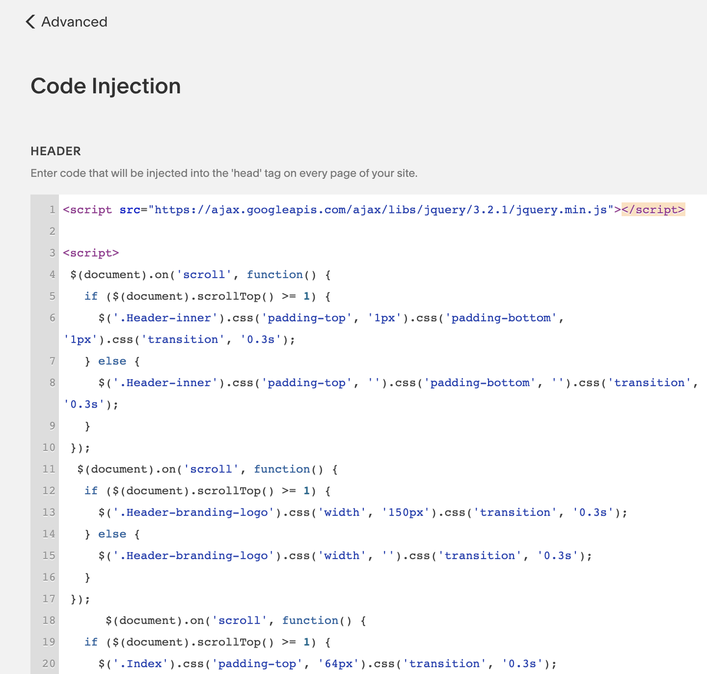
Step 4: If your header is very tall, you may want to have it shrink on scroll, which may be done through reducing your logo size and/or reducing the amount of padding at the top and bottom of the header. If you desire this, in your admin panel go to Settings—>Advanced—>Code Injection and insert the following into your site-wide Header (make sure you do this in the Code Injection area for the whole site, not for an individual page):
<script src="https://ajax.googleapis.com/ajax/libs/jquery/3.2.1/jquery.min.js"></script>

<script>
 $(document).on('scroll', function() {
   if ($(document).scrollTop() >= 1) {
     $('.Header-inner').css('padding-top', '1px').css('padding-bottom', '1px').css('transition', '0.3s');
   } else {
     $('.Header-inner').css('padding-top', '').css('padding-bottom', '').css('transition', '0.3s');
   }
 });
  $(document).on('scroll', function() {
   if ($(document).scrollTop() >= 1) {
     $('.Header-branding-logo').css('width', '50px').css('transition', '0.3s');
   } else {
     $('.Header-branding-logo').css('width', '').css('transition', '0.3s');
   }
 });
      $(document).on('scroll', function() {
   if ($(document).scrollTop() >= 1) {
     $('.Index').css('padding-top', '60px').css('transition', '0.3s');
   } else {
     $('.Index').css('padding-top', '').css('transition', '0.3s');
   }
 });
 </script>
The first item in this code block reduces the amount of top and bottom padding for your navigation bar as you scroll. To change the amount of padding, experiment with the number that is “1px” in my example. The second item in this code block reduces the logo width as you scroll. To change this, experiment with the number that is “50px” in my example. The third item in this code block moves your index page up as you scroll, because otherwise there might be a small white gap when you first begin the scroll; this just smooths it out. It may not be necessary based on your other settings.
That’s it! You’re done!
Fixed Bottom Header
This is slightly more complicated because the bottom header is designed as an overlay without a background color. Squarespace also makes the text change colors based on whether or not you have a page banner. But if the header is fixed, you’ll probably want to add at least a semi-transparent background so it continues to be readable as you scroll.

Step 1: In your admin panel, go to Design—>Custom CSS. Paste the following code in the Custom CSS area:
.Header--overlay.Header.Header--bottom {
  position: fixed;
  top: 0px;
  z-index:9999;
  background-color: rgba(0, 0, 0, 0.5);
  padding-bottom: 10px;
}

.Header.Header--bottom {
  position: fixed;
  top: 0px;
  z-index:9999;
  background-color: rgba(0, 0, 0, 0.5);
  padding-bottom: 10px;
}
You will need to adjust the bottom padding (in my example 10px) until it looks right. You can change the background color to any color matching your website theme; you can also add a drop shadow as I explained in the top header instructions. To adjust the colors of your navigation and site title text, go to Design—>Site Styles and edit the bottom navigation colors on overlay.
Step 2: You will notice once you save this CSS that it alters the layout of pages (such as blog posts) that don’t have a banner at the top. To fix this, paste the following code in the Custom CSS area, adjusting the number of pixels based on the height of your header.
.Main {padding-top:100px !important;}
.Main.Main--page {padding-top:0px !important;}
Step 3: But now you’ve created a problem in mobile view, so add the following in the Custom CSS area to fix it:
@media only screen and (max-width: 480px) {
  .Main {padding-top:0px !important;}
}
Step 4: If your header is very tall, you may want to have it grow narrower on scroll, which may be done through reducing your logo size and/or reducing the amount of padding at the top and bottom of the header. If you desire this, go to Step 4 for a Fixed Top Header and follow the same instructions.
That’s it! You’re done!
Fixed Combo Header
If you are using both top and bottom headers, you can make the top sticky, the bottom sticky, or both sticky. I’ll combine the steps into one code block for each of the options, to keep it simple. If you want more understanding of what the code means, look at some of my explanations above.
Combo Header Option 1: Sticky Top Header Only
In your admin panel, go to Design—>Custom CSS. Paste the following code in the Custom CSS area:
.Header.Header--top {
  position: fixed;
  top: 0px;
  z-index:1000;
  width:100%;
  box-shadow: 0px 2px 3px rgba(0,0,0,0.1)}

.Header.Header--bottom {
  z-index:999;
  margin-top:100px;
  box-shadow: 0px 0px 0px;
}
.Intro {padding-top:100px;}
.Index {padding-top:100px;}
.Main {padding-top:100px;}
.Main.Main--page {padding-top:0px !important;}
.Main.Main--blog-item {padding-top:0px !important;}
@media only screen and (max-width: 480px) {
.Main {padding-top:0px !important;}
.Intro {padding-top:0px !important;}
.Index {padding-top:0px !important;}
}You will have to adjust the top margin of the bottom header and the intro, index, and main top padding (in my example 100px) based on the height of your top header. You can also add a background color to your bottom header by using the instructions in Step 1 of Fixed Bottom Header.
Combo Header Option 2: Sticky Bottom Header Only
This option is unique, because it is the only one that uses {position:sticky} instead of {position:fixed}. I have not found a way to make it work if you have a Gallery (like a slideshow) as the first section of an Index Page; if you’ve found a solution, feel free to help us out in the comments!
In your admin panel, go to Design—>Custom CSS. Paste the following code in the Custom CSS area:
.Header.Header--bottom {
  position:sticky;
  position: -webkit-sticky;
  top:0px;
  height:100px !important;
  z-index:9999 !important;
  background-color:rgba{255,255,255,0.9};
  box-shadow: 5px 3px 5px rgba(100,100,100,0.2)
}
.Header-inner.Header-inner--bottom {height:100%; padding-top:2px !important;}
You will need to adjust the .Header.Header—bottom height (in my example 100px) and .Header-inner top padding (in my example 2px) based on the size of your header. Adjust the background color and drop shadow as desired.
Combo Header Option 3: Sticky Bottom and Top
In your admin panel, go to Design—>Custom CSS. Paste the following code in the Custom CSS area:
.Header {position:fixed; z-index:1000; width:100%;}

.Header--overlay.Header.Header--bottom {
  position: fixed;
  top: 50px;
  z-index:9999;
  background-color: rgba(252, 252, 252, 0.7);
}

.Header.Header--bottom {
  position: fixed;
  top: 50px;
  z-index:9999;
  background-color: rgba(252, 252, 252, 0.7);
}

.Main {padding-top:100px !important;}
.Main.Main--page {padding-top:0px !important;}
.Intro.Intro--has-image {padding-top:100px;}

@media only screen and (max-width: 480px) {.Main {padding-top:0px !important;}}
@media only screen and (max-width: 480px) {.Index {margin-top:0px !important;}}
You will have to adjust the .Header.Header—bottom top position (in my example 50px) based on the height of your top header. You will have to adjust Main and Intro top padding based on the height of both headers (in my example 100px).
For All 3 Options:
If your header is very tall, you may want to have it grow narrower on scroll, which may be done through reducing your logo size and/or reducing the amount of padding at the top and bottom of the header. If you desire this, go to Step 4 for a Fixed Top Header and follow the same instructions. For combo headers, I recommend changing only the logo width, given the complexity of the situation, but if you feel confident, play around with all your options!
I hope you’ve found what you’re looking for! If not, feel free to post a comment and I will try to help you out in my reply!

Did I help you out? Want to say thanks?
Send me a little donation that reflects the value you found in this solution. I really appreciate it!